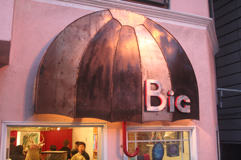
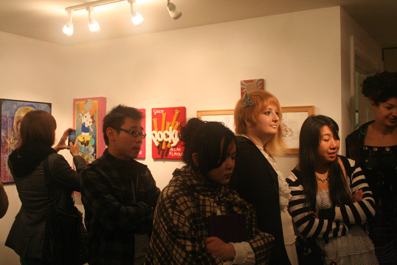
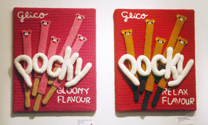
I thought I would show you a few more photos of the Pocky Paintings. Unfortch, they still aren’t great quality. We didn’t realize that our camera has been set to a crazy high ISO for who knows how long, so everything has been really grainy for a long time, and I didn’t have the knowledge to know why! Thanks to Erik Hansem for solving the mystery! Anyway, onto the pics at Big Umbrella Studios!
When I got to the gallery, the pink painting had already sold. Way cool!
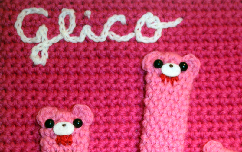
Hello, Gloomy Bear! You can’t really tell from these photos, but the blood on his face is a bit metallic and sparkly.
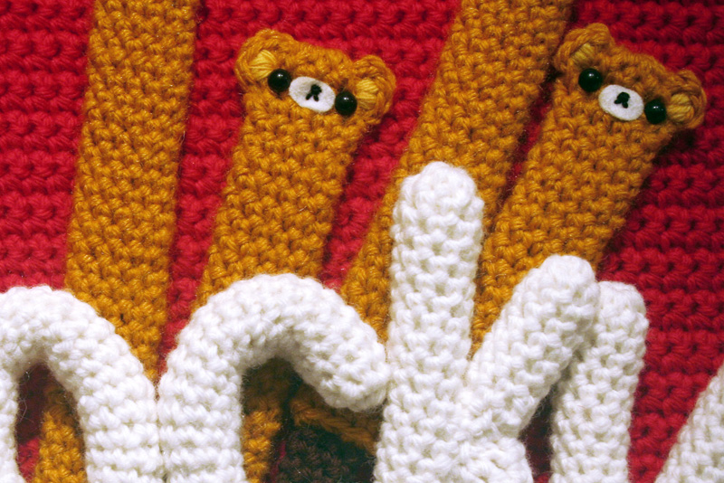
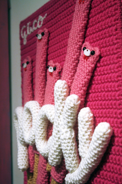 Here’s a bit of a side view. I wanted to show you guys the 3-D-ness.
The Pocky lettering was really fun, but a little unwieldy. I wanted them to kinda look squished together and chubby, and they kept springing back out all over the place. It would have been a good time to have four hands!
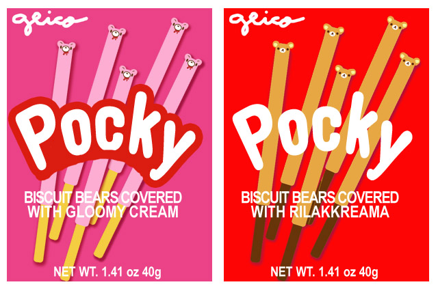 As you may or may not know, I often start all my work with rough sketches in photoshop. Sometimes your project doesn’t always pan out the way you thought, but, sometimes things like TIME just get in the way, so you have to adapt. Clearly, I did not end up with as much lettering as I’d wanted, but I still think it turned out ok!
There was also the issue of how to cleanly render the text ON TOP of the Pocky sticks. I considered beading, altho that probably still would have looked lumpybumpy, but I may still try it later on.
I may come up with a few more fantasy flavors to make paintings for the Etsy shop, since both of these sold already.
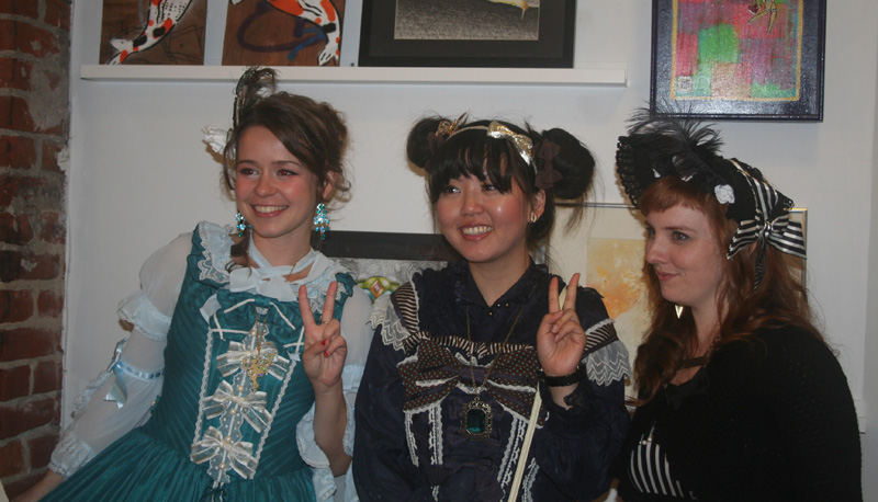
I’ll put some other photos from the gallery – including me eating a big sandwich – under the cut!
